Thursday, January 30, 2014

Scrapbook Page Construction and New Products

Finally, I squeezed in some design time.  Oh yeah, I guess you could say, it was "Time Well Spent".  Sorry, I had to.

Time Well Spent page kit is brand new in the store at Digital Scrapbook Place.  Currently running until February 8th is a posting challenge where you can get the add on pack for FREE!
I thought I'd take a moment and show how a quick page comes together for me.

Yes, this is a quick page for me as I really did not spend a ton of time on it.

Oh... I should mention that I used extra papers which will be available for purchase as soon as I can get them loaded into the store at Digital Scrapbook Place.

Okay... so here is where I start....
 I grab my FAVORITE paper from either the kit, the add on pack, or the paper set and build on it.  That's just what I do.  Some people prefer to start with a blank page so they don't accidentally save over their favorite paper.  (I know where I can find the original so I'm not so worried.)
The kit and the add on pack in this case both included cute vertical photo frames.  The one of the left has a tiny eye catching detail at the bottom right where it lifts just a bit.  Anyway, it's fun to find a singe photo and arrange two frames over it to showcase only the important parts of the photo.  In this case, it's the two women talking. (Okay, so yeah, that's me on the right several years ago.)
Select and copy only the portion of the photo that would be in the frame on the left and then do the same for the right.  BUT... CRITICAL HERE.... COPY, do NOT cut.  We need to keep the original image handy.  I tend to always do that in case I want to change something.  Turn off the layer of the original image but do not move it.  We can't go back to it if it's not lined up where it should be.

So, the subject on the left has her poor hand cut off.  That's terrible.  That's also an opportunity for an OUT OF BOUNDS which just happens to be one of my very favorite things to add to a page.  (I wrote a TUTORIAL for out of bounds HERE.)
I went back to the original which was still there and in the same position and I selected her hand.  I copied it and moved it up in the layers so it sat on top.  It's really kind of strange looking without the drop shadow to make it pop.  (The TUTORIAL outlines adding the drop shadow.)
Ahhhh.... that's better.  Now, at this point, I always find that it's a good idea to collect all of the layers in this out of bounds portion of the layout into one group.  From the hidden original photo up through the subject photos, the frames, the drop shadow of the hand and the hand... all of it grouped together so there's less of a chance of a layer getting skewed.

Now I start to assemble my page.  It's digital so it's quick and easy to simply slap a bunch of stuff down.

Slip in some of the papers to create a main focus part of the page.  I like stacking papers so that it's not a single focus piece but it has accents... character... a little more color.
Which is pretty much how I ended up with this within about three minutes flat.  Oooo... little too much, me thinks.  Oh yeah... too much.  It's just too cluttered... the focus of the page is lost to all of the BEAUTIFULLY DESIGNED embellishments on this page.

That's when I start to mess around with things.  Good thing I grouped the main photo.  I would hate to mess that up with my messing around. 

This next part is the BEST part of digital.
First I clipped the large clock face stamp to be only on the light blue paper.  That's a little better. See how just that little bit of trimming cleans up the page?
The stamp still felt a little heavy so I lightened the opacity.  I also ditched the green fabric trim that I had originally tucked behind the photo group.  I didn't really ditch it, I turned off the layer.  I leave it in case I might want it in a different location or to try it again in the same spot.
 I centered up the title, lowered the opacity of the clock face stamp a little more...
I pulled in another embellishment...  Oh yes I did... on a page that I claimed was too busy. 
I brought in the tiny wood heart token for the clock hand.  I also moved the modern clock face and clock had around a bit until I liked where they were at.  Not much, just a little.

Then I stared at the page and asked myself, "Why are you not happy NOW?"

And I answered myself, because that's the polite thing to do, "The lovely flower... it's too big.  It catches my eye and holds it preventing me from moving about the rest of the page."

AND because I ALWAYS listen to myself, I made the flower smaller and tucked the circle journal paper under the photo group.


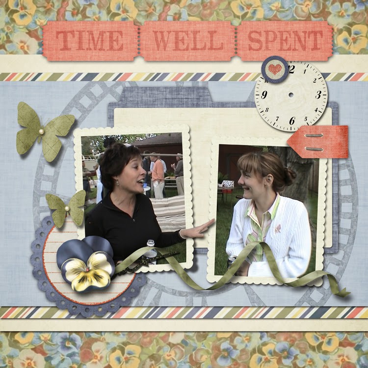
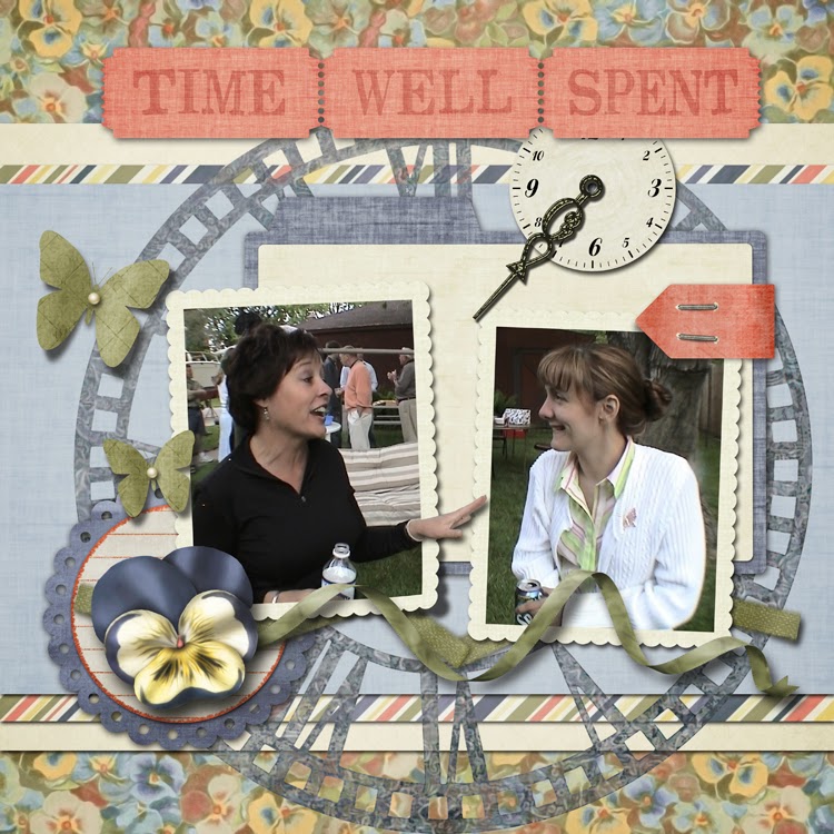
Page arrangements are best when they direct the eye easily around the page.  For the most part, this arrangement directs the eye in a clock-wise fashion starting with the title.

OOOO....  Yikes..... I just caught this.... that clock hand may have to go.  It really does stop the flow that I want which goes from the title, follows the right side of the clock face stamp, along the ribbon, and up the flight path of the butterflies.  As much as I wanted that clock hand to POINT to the conversation in the photo, it derails my flow.  Can't have that.

A little adjustment in location to the clock face and the wood heart token was needed after the clock had was removed.
I may have ditched one clock hand but I used another.  Do you see it?  It's almost hidden now but that's how it should be.  It's still there to point out the important part of the page but it certainly is not going to derail the flow.

I hope you enjoyed this little tutorial on page arrangement.

My digital scrapbook products at Digital Scrapbook Products can be found at Digital Scrapbook Place and My Memories.

Come chat with me EVERY WEDNESDAY at Digital Scrapbook Place.  There a great chat room there that's easy to use.  The chat is at 9 PM Easter Time.

You must be registered at DSP to log into the chat room... it cuts down on the rif-raf... 'cause we are wild enough on our own.  BUT registration is easy and it's FREE!!!  I wrote a tutorial for it.  It can take up to a few hours for your registration to go through the "this is not a spammer process".  This I know, because I'm part of the team the lock the doors when the spammers are knocking.  We like DSP to be free from icky spammers.

Click HERE for that registration tutorial.

I'll be chatting on Wednesday.  Come chat with us!!!


Oh... I almost forgot....
My FAMOUS Author Girlfriend, Lisa Wingate, has a new book coming out in February.


Wildwood Creek is the last book in her Moses Lake series of books.  With Lisa's books, there's really no need to concern yourself with the order she wrote them in.  You can read them out of order and not be confused.  I like that about them.

Wildwood Creek is a bit of life discovery, a hint of romance, drama, and a whole lot of suspense... but not too scary.  I promise, the suspense won't give you nightmares but the book will keep you up.  Once you get into the storyline, you WON'T want to put the book down.  This I know... One of the early readers and my BEST digital scrapbook customer was planning to be a no show at my chat last week so she could finish the book!  Are you KIDDING ME?  I think then she remembered who got her on that early reader list and she did attend the chat.  I suspect she simply logged in and scattered a couple of comments here and there.  She was likely still reading the book.  LOL... It's what I would have done.  Yes, the story is that gripping.  You can read the first 22 pages of it HERE.


Friday, January 17, 2014

Photo and Link Tutorial for vBulletin®

We've got some fun stuff going on over at DSP and some of that stuff requires the ability to post images or links into a forum or thread.  I wrote up this tutorial to show anyone who struggles with this type of thing just how to do it.

DSP uses vBulletin so this tutorial is geared for that.  There used to be some pretty nifty short cuts for getting images pasted into the threads but certain browsers tend to like to add a TON of gobbly goop to the web address and vBulletin limits character count to 5,000 or something like that so when all that gobbly goop is added because of the short cut, an error message pops up.  It's very frustrating.  So HERE is how you post pictures and links in a thread the correct way.

Okay, so you've found the photo or page on the site or anywhere on the internet for that matter and you want to include it in your reply or comment on a thread in the forums. 
This is layout was the most recent in the gallery when I wrote up this tutorial.  It just so happens to be a page by Sands_Healy.  I always enjoy her pages and her photos.  Anyway, for what ever reason, this is the photo you want to post.

First, right mouse click on the photo.
That little window there will pop up with some options for you.  Pick "View Image".

This is what you get when you do that.

You need to grab the web address which is at the top.
Highlight the whole stinkin' thing unless it's got something that says "&zenid=.....gobbly goop....."  This can happen when you grab an image or link from the DSP store which is powered by Zen Cart.  I guess it's kind of like having your underwear showing, it just happens.  If that happens, highlight everything up to, but not including the "&".  It's that zenid word.  It's like a bad word for links or something.

Anyway, so you've highlighted the web address for the pretty picture and you need to copy it.  This can be done by another right mouse click which will bring up another little box where you will find the word "Copy" OR the keyboard short-cut of "ctrl" and "c" for windows ("command" and "c" for mac).

Head back over to the tab where the thread is and click on the "Go Advanced" button.  Oh yeah, big time here!!

When you click on that, this screen comes up.  Yuppers, a whole lot of options. 

Right at this moment, we are only interested in the "insert picture" icon.  Looks like a basic landscape photo.

Once you click on that, a box pops up where the web address goes.  You can either right mouse click again on that blue highlighted text and choose "paste" when that option box comes up, OR you can hit "cntrl" + "v" ("command" + "v") to insert the address or URL of the image into the space.

Then click okay.

What's left is this bit of code.  It may or may not be highlighted in blue like it is in the image.  The highlighted part is the web address or URL of the image and the other two bits is the code that tells vBulletin to stick the picture in there.  And there's no need for a super secret decoder ring, COOL!

After typing in what ever comments you have, click the submit reply button.

And, ta-DA... just like magic, there's the picture!


Okay, that's all well and good, but what if you just want to put a thumbnail image into a thread?  Thumbnails are the smaller images from the gallery.  Not sure where or why the word "thumbnails" came from for this situation...maybe someone wrote a dissertation all about it or maybe I should just move along with the tutorial.   Anyway...moving along... do that right mouse clicky thing again to get the thumbnail image alone. 


The grab that address or URL thingy again.

Navigate back to the thread and hit the "Go Advanced again".  Yes, totally the same way.

Same as before.  Kind of boring now, isn't it. 

Pop it in there, press okay...
Yeah, yeah, yeah... easy peasy.

Let's shake things up a bit here. Let's get a link directly to the page address in there.

Go back to the tab where the thumbnail is and hit the go back.

That will take you back to the gallery of all of those thumbnails... (my toe nails are painted blue, by the way... not that anyone can see them... 'cause it's winter... and I wear two pairs of socks.)
Click on the thumbnail to get to the big image.

Grab that big image web address just like you did before.

Navigate back to the tab where the thread with your other bit of code is hanging out.
OOoooo, I lost my big orange arrow.  Sorry... can you see the icon with the Earth and the clippy thing.  That's what my big orange arrow would be pointing to if I hadn't lost it.

Anyway, when you click that icon box, this pops up and.... well, you know what to do.  Slip the address in and click OK.

Lot's more gobbly goop of secret code.  COOL!

Click submit reply....

...and this is what it will look like.
Not bad.  Serves the purpose, a thumbnail and a link.  BUT guess what, we can make it prettier.

BEEP. Beep, back the truck up. At the point where the code for inserting the thumbnail is where we need to be.  Okay, now... highlight the thumbnail image address (URL) and those two codes on either side of it like I did here.

The go back to the full page again to get the URL of the page.  Highlight it and copy.

Oh look, I found my big orange arrow!  Click on that Earth + clip icon again...
...and paste in the URL to the page.

Wooooooooe Nelly, that's a whole lot of Goggly Goop Code there.  It's okay, trust me, it'll work.

After hitting submit reply this time, you'll end up with just the thumbnail.  Where did the link go????
That's where the magic comes in.... that thumbnail is now the link to the actual page.  If you let your pointer hover over the thumbnail, the web address (URL) to the actual page you have your link for will show up at the bottom of your screen.  How cool is that????  And when you, or anyone else, clicks on that thumbnail, they will go directly to the page.  Pretty neat, eh?  That's called a pretty link.


I hope you enjoyed my tutorial and can use this new secret code knowledge for the upcoming festivities that are going on over at Digital Scrapbook Place.